Overview
During the winter flu and 'cold' season, 2019 to 2020, claims were made that this time the 'cold' was deadly and spread by people around the world. January 30, 2020, the World Health Organization (WHO) Emergency Committee ... :
Government and health care officials announced that the symptoms of the common cold - coughing, sneezing, fatigue etc. - were symptoms that were followed by an alarming amount of death, and everyone was susceptible, even people who had no symptoms. They did not call for calm and sober second opinion. Nor were traditional treatments advocated such as rest, staying home for a couple of days, drink plenty of fluids, chicken noodle soup. Nor were Hydroxychloroquine, Ivermectin, Vitamin D, and fresh air suggested. Instead, Doctors who advocated early intervention alternatives to the 'vaccine' were prosecuted.
Many in media and government spread the "concern" quoting Imperial College of London Professor Neil Ferguson, a virus modeler who on March 16, 2020 published a report asserting:
Professor Ferguson's warning was repeated through out main stream media news. For example, the Financial Post stated Ferguson "sounds the alarm" (rather than 'sounds a concern') ...
Really? Did Covid-19 cause death across all age groups equally - all age groups from young children to the elderly? Or were deaths clustered in particular age groups? Reports from China highlighted that Covid-19 caused deaths mostly among the elderly. Covid related deaths in Italy were among the elderly in care facilities.
In Canada, according to the British Columbia CDC March 23, 2020 Situation Report, published shortly after the Public Health Emergency was declared in BC, March 17, 2020, the median age of death (similar to average age of death) was 86 years of age. By mid-December 2020, the median of death was still 86 years of age. Older than life expectancy.* Hence, the call to protect Grandma.
However, the median age of death from the Spanish Flu was closer to 30 years of age, hitting young adult males first then spreading to other age groups. On the other hand:
And
And
This simple fact, the difference in the median (and average) age of death from the 1918 Spanish Flu (~30 years of age) compared to 2020 Covid-19 ( ~80 years of age (~86 years of age in British Columbia - older than life expectancy)) is basic knowledge for any student or Professor of Population Studies, including Neil Ferguson. Perhaps, not unrelated, the Bill and Malina Gates Foundation gave Imperial College $100,000,000 (US$) in 2020. (see their website).
Already concerned for their lives, people were also told by World Health Organization Director General, Tedros Ghebreyesus:
Dr. Tedros Ghebreyesus, and the WHO, also knew he, and they, are not telling the truth.
Regardless of knowing the truth, healthy and sick people were told to social distance, self-quarantine and wait for a 'vaccine'. According to statnews.com pharmaceutical manufacturers responded in February 2020, developing experimental, viral vectored 'vaccines' (https://www.statnews.com/feature/corona virus/drugs-vaccines-tracker/).
Nonetheless, the 'corona vaccine' ("emergency use only" - "interim use only" in Canada) began to be administered in earnest in January 2021. Some people claimed the emergency authorized 'vaccine' was safe and effective. Others asserted the vaccine was harmful and sometimes lethal.
What's going on?
This article will examine government data produced by Statistics Canada: 1) to see if in 2020 the number of deaths increased above normal variation, and 2) whether the number of deaths in 2021 were back to normal - within the highest and lowest numbers from the years prior to 2021. Both relative to the estimated number of people over 70 years of age in Canada.
In other words, did the number of deaths in each year, 2020 and 2021, increase or decrease above or below normal variation from 2001 to 2021 or did it fall within normal variation from 2001 to 2021?
Data
Statistics Canada (STC) provides three population specific datasets that provide the numbers of interest.
Dataset 1: Quarterly Natural Increase, components, namely births and deaths from 2001 to 2021 by quarter (i.e., Quarter 1 is January to March inclusive).
"Table 17-10-0059-01 Estimates of the components of natural increase, quarterly"
Dataset 2: Annual Population Estimates by age and sex, for Canada as a whole for 2001 to 2021. Provinces and Territories data is also available. This dataset includes births and deaths also.
"Table 17-10-0005-01 - Population estimates on July 1st, by age and sex"
Dataset 3: All Cause Mortality data, provides the number of deaths by cause, by age (All Ages as well as Age at time of death, 70 to 74 years; 75 to 84 years; 85 and over) from the year 2001 up to and including 2020.
"Table 13-10-0394-01: Leading causes of death, total population, by age group"
Datasets 1 and 2 cover the years 2001 to 2021 (quarterly includes an estimate for Q1 2022 but not used for the purposes of this examination) while Dataset 3 only goes to the year 2020. All datasets are for Canada as a whole and are available online.
Methods
First, a Dataset Comparison Table (Table 1) is adapted from the 3 STC datasets starting with the Annual Population Estimates providing the total population as well as the number of people over 70 years of age.
The number of deaths by year found in the Annual Population Estimates is compared to the number of deaths found in the All Causes Mortality dataset by year (2001 to 2020). The difference between the two Datasets is found in the last column, All Causes vs Population Estimates - All Causes vs Pop Est.
Also included are the components - Births and Net figures - of Natural Increase (also Referred to herein as Natural Change as more areas experience more death than births). These variables will be graphically represented in a chart (Chart 1) to provide an overview of the demographic trends in Canada over the last 20 years, 2001 to 2021. A polynomial trendline is added to highlight the exponential rise in the number of people aging into the high mortality years, 70 years of age and older (as Canada ages).
As mentioned above, the All Causes All Ages dataset only goes to the year 2020. In an effort to facilitate analysis of this dataset to 2021, a proxy value for 2021 from Annual Population is included (red font). This will be discussed further below.
Table 2 draws from STC's All Causes Mortality data including total number of deaths All Ages and the broad age groups, 70+, and <70 as well as the percentage of deaths 70+ over Deaths All Ages.
In an attempt to explain the increase in the number of deaths as a result of the aging of the "baby boomers", a comparison between the total deaths and the number of people below and above 70 years of age using "All Cause Mortality" data, set out in Table 2, is represented in Chart 2.
A polynomial trendline for each of the variables is added, again to provide a central tendency with which to compare to the spurious values, particularly in the most recent years, 2017 to 2021.
Chart 3 is calculated from the Annual Population Estimates in Table 1 to see if the change in number of elders (70+) is similar to the change in the number of deaths 2001 to 2021 in Canada.
Chart 4 is also calculated from Table 1 but uses the All Cause data to the year 2020 with the addition of a proxy for 2021, namely the 2021 number of deaths from the Annual Population Estimates.
Chart 5 represents the numbers found in the Quarterly Natural Increase estimates data from STC. Quarterly data varies sharply due to the rise and fall in the number of deaths from the winter (more death) to the summer (less death). By far more elders die in the winter (cold, dark) while more young adults die in the summer (sunshine and adventure).
Findings
Estimated Total Number of Deaths Compared With Births
The estimates for the number of people 70 years of age and older are added to Table 1 and graphically represented in Chart 1.

The yellow and orange portions of Table 1 cover the last 5 years, 2017 to 2021. The yellow portion is referred to as Preliminary, and the orange is referred to as Updated. The portion of the table that is not colored is referred to as Final. Notice the difference between "Annual Population Estimates, Deaths" compared with the "All Causes All Ages Deaths" in the Dif (for Difference) column. There is no difference 2001 to 2016 - but there are differences 2017 to 2020. The 2021 estimate for All Causes is not yet available at the time the data was gathered for this article. Nonetheless, the number of All Causes Deaths is lower than Population Estimates Deaths by 225 in 2019 and 1,108 in 2020.
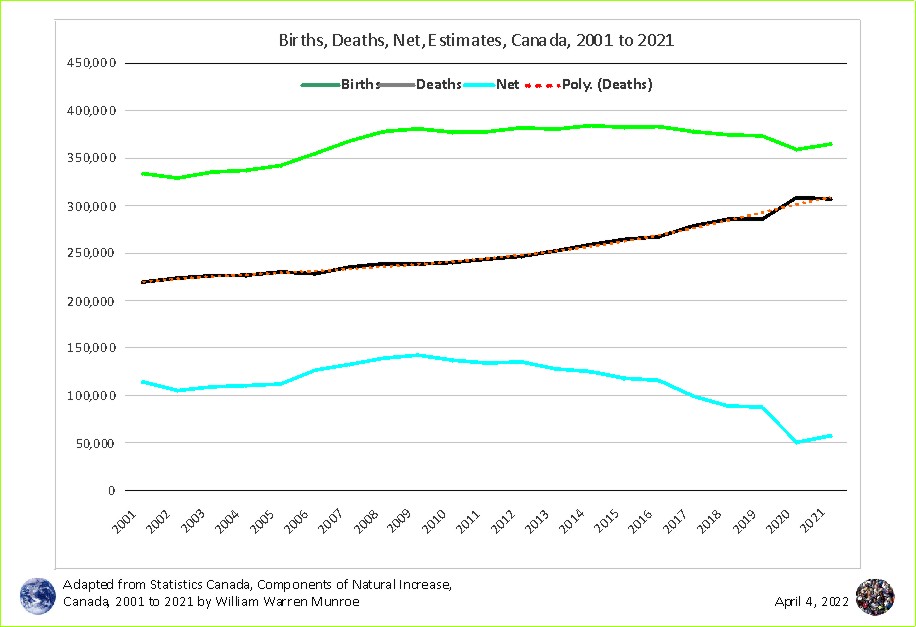
Chart 1 shows the number of births (green line) rose from ~330,000 in 2001 to ~375,000 in 2008 then leveling off until it dropped marginally in 2020 and 2021 ~360,000.
On the other hand, the number of deaths (black line) has continued to increase from 2001 to 2021 from ~220,000 in 2001 leveling out to ~285,000 from 2017 to 2019, then jumping up to nearly 310,000 in 2020 only to lower by ~1,000 in 2021.
The line of red dots superimposed on the deaths (black) line represents a central tendency taking out the ups and downs of the last 5 years in particular. Death data is categorized as "Preliminary" then "Updated" before being referred to as "Final" in 5 years. This, in part, explains the difference between the two datasets seen in Table 2.3
The estimated number of deaths is subject to change as more information comes in about deaths of Canadians outside of the country and non-Canadians inside the country and not unusual administrative issues. Confidence in the Preliminary data in understandably lower than the resolved "Final" data.
The net natural change (births minus deaths) (blue line) shows the impact of Canada's changing demographics. Deaths will likely continue to rise at least for the short term (boom, bust, echo) while births may continue to slowly decline. If international in-migration were to have stayed around the 2016 quota of 250,000 people a year, then Canada's total population would level out between 40 to 45 million people by 2060.4
Changes in Deaths by Broad Age Groups
Table 2 shows the estimated number of total deaths from the year 2001 to 2021 as well as the All Cause Deaths 2001 to 2020 and the number of deaths by broad age groups <70 (0 to 69 years of age) and 70+ with percent of Deaths 70+ relative to All Causes, Deaths All Ages.
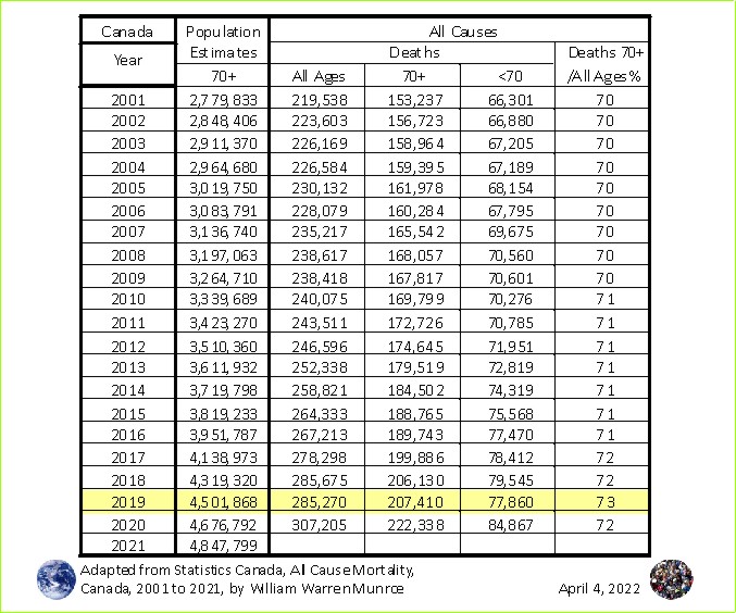
The percent Deaths 70+ relative to Deaths All Ages increased a percent from 72% in 2018 to 73 in 2019 then back to 72% in 2020 reflecting the unusual dip in the Deaths All Ages. Instead of the year 2020 gaining a percent or two, 2019 stands out as being below 2018 deaths (the 3rd column, All Causes, Deaths All Ages).
What does the annual change in All Causes, Deaths all Ages, for 2001 to 2020, look like? And how does this compare with the change in the number of "0 to 69" and the "70+ Deaths"?
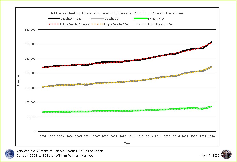
All lines are fairly smooth at least until 2017 becoming more spurious from 2017 to 2020. This spuriousness is due, at least in part, to the tentative natural of "Preliminary" data recognized as containing administrative error and is subject to change. In effect this means that there is less confidence in these later numbers. It is not uncommon for the spuriousness to diminish as error is addressed and the estimates are categorized as "Final".
Also of note are the dotted trendlines giving a central tendency line with which to compare the variation in the solid lines. All lines show a few small declines below the trendline usually followed by an increase above the trendline.
The estimated total number of deaths has been rising overall since the year 2001, increasingly so in the most recent years.
This is a result, at least in part, of the increase in the number of people aging into the high mortality years 70 years of age and older (70+). On the other hand, the <70 age group (aka 0 to 69) remained relatively flat with a marginal increase in the most recent years reflecting the aging population. Canadians are living longer. Life expectancy increased from ~65 years in the 1960s to over 80 now.
Functional relationship?
As people age into the high mortality years (70+), does the total number of deaths increase as well? In other words, is the change in the total number of deaths a result of the change in the total number of Canadians over 70 years of age?
Since more people are living longer and aging into the high mortality years, the number of deaths will also increase. The one thing people can be sure of is death - everyone dies although some have tried and continue to try to live forever.
These two variables, total deaths, and the estimated number of people 70 years of age and older can be used to create a scatterplot with the addition of a measure of how much the change in the number of elders (70+) explains the change in the total number of deaths. The measure of the strength of a functional relationship such as this is called a regression given as a ratio (R2) calculation (a way to quantify the strength of a relationship - as one moves, does the other).
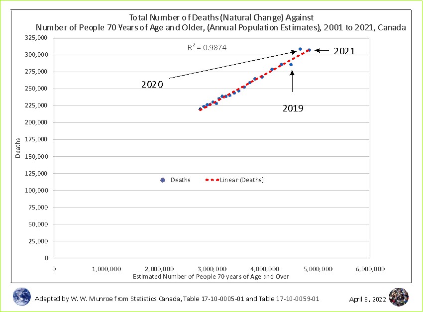
The larger blue dots represent the number of elders (70+) (x-axis) and the corresponding total number of deaths for each year 2001 to 2020 for Canada (y-axis), using numbers found in Table 1. The change in the number of elders (70+) almost entirely explains the change in the number of deaths - almost 1 to 1 (0.99). Seldom is such a strong relationship found in social sciences. However, the last three highest, and to the right, dots representing the years 2019, 2020, and 2021 are not yet 'Final' and therefore are subject to change.
All Causes Deaths, All Ages data can also be compared to the total estimated number of elders and represented in a scatterplot with the addition of a r squared (R2) value. Since All Ages data for 2021 is missing, a proxy can be used, namely the 2021 value from the Annual Population Estimates - Table 1 red font.
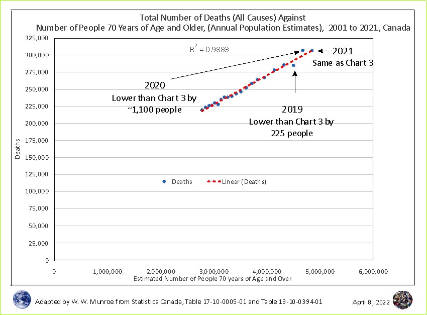
Using the All Cause Deaths data results in a very small increase in the R squared calculation (to 0.9883). The difference highlighted in Table 1 is why the R2 value is higher. The distance to the trendline is shorter using All Cause data. One last dataset is added here to see more closely whether the claim that deaths were unusually high is supported or not.
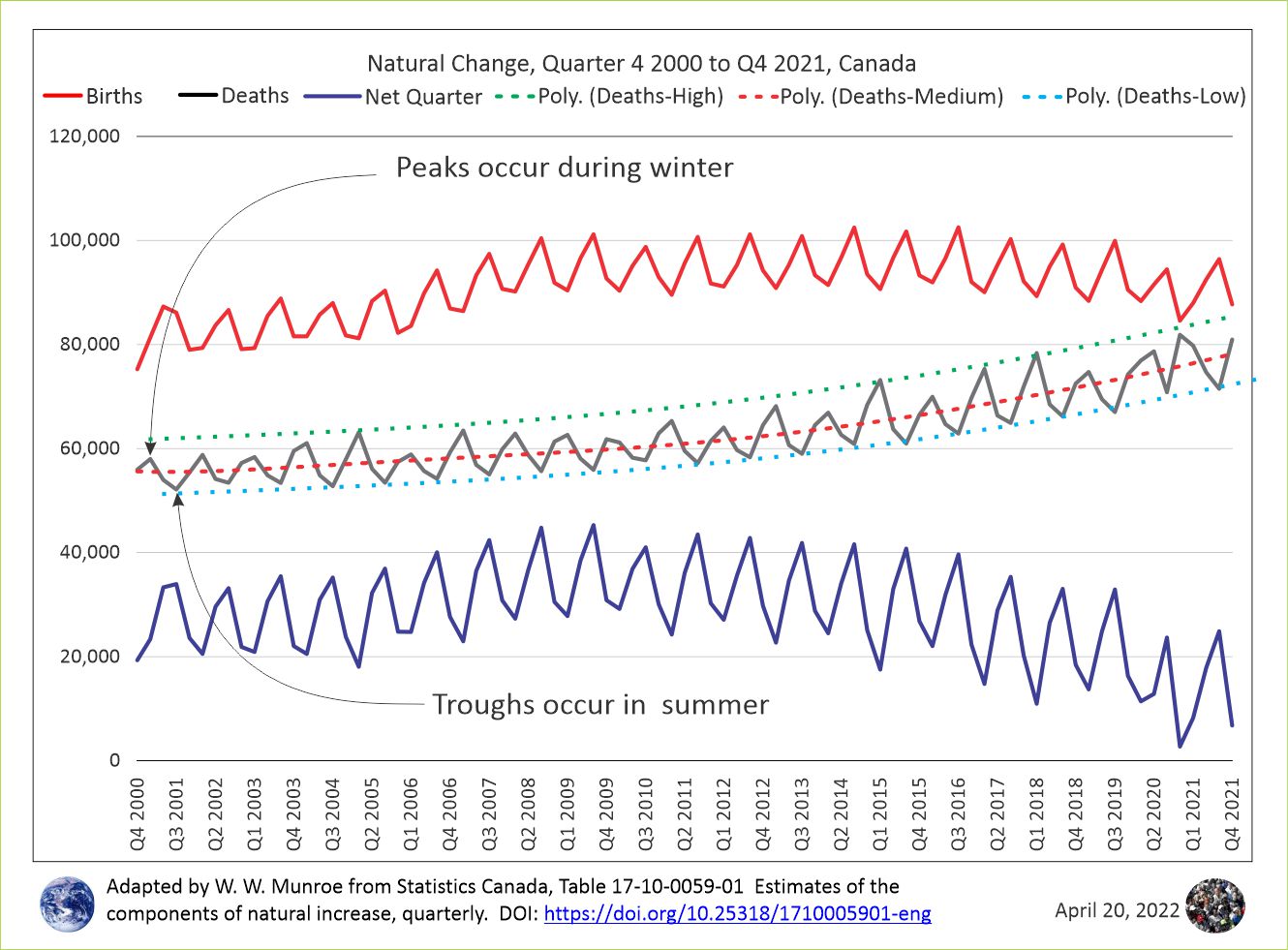
The jagged lines show the repeated cycle of highs deaths in winter and fewer deaths in summer for Canada as a whole.
The line of particular interest is black representing the number of deaths from Quarter 4 2000 to Quarter 4, 2021 for Canada. It shows that the rate of growth of the number of deaths is increasing exponentially rather than in a linear manner. This relects the rise of the baby boomers - the gradual resumption of procreation after WWII gathering momentum climaxing in the revolution of declining reproduction - 1946 to 1964.
Also of interest are the red dots running through the center of the death numbers representing a measure of central tendency taking out the spuriousness in the death numbers varying by quarter. Adding trendlines touching the peaks (green dots) and touching troughs (cyan dots) leaves the impression that the number of deaths for the most recent quarters does not exceed the variation of previous quarters.
Summary
This article examined government data, Statistics Canada: 1) to see if the number of deaths increased above normal variation, in 2020, compared to previous years and 2) whether the number of deaths in 2021 fell in the normal variation from 2001 to 2021.
At first glance, the numbers available from STC datasets (Table 1) seem to support the argument that deaths were abnormally large in 2020 in Canada. Also, deaths appear to return to normal in 2021.
The All Cause Mortality data (2001 to 2020) shows an unusually high increase in the number of deaths from 285,270 in 2019 to 307,205 deaths in 2020, an increase of nearly 22,000 deaths - mortality by far higher than previous years (Table 1); but, is it outside of normal variation?
Looking at the Annual Population Estimates dataset (2001 to 2021), deaths increased (soared?) up from 285,495 in 2019 (the numbers differ between the datasets) to 308,313 in 2020 - up nearly 23,000 (22,818).
Then in 2021 (the year of the 'vaccine' roll out) the number of deaths dropped by ~14 hundred (-1,396) to 306,917.
However, these numbers do not address the overall demographic trends including the increase in the number of people aging into the high mortality years, 70 years of age and older.
As it turns out, further examination revealed that most of the variation in deaths is explained by the change in the number of people aging into the high mortality age, 70+ (a R-squared of almost 99%). This leaves, at most, 0.01 (1%) of the variation to be explained by other variables including administrative error (Charts 3 and 4).
Also, Chart 5 shows that the variation quarter to quarter is similar for the last 20 years. More people die in the winter than in the summer.
The argument that deaths went up 2019 to 2020 due to covid, then down from 2020 to 2021 as a result of the experimental injection is not supported by the data. The ups and downs were similar to previous quarters.
This examination of STC data found 1) the number of deaths in 2020 was within normal variation compared to previous years and 2) the number of deaths in 2021 was also within normal variation compared to previous years.
What do you think?
* This sentence was reworded to be clearer, 2023-02-26.
1 Table 1 includes the following three datasets
Source Statistics Canada: Table 17-10-0005-01 - Population estimates on July 1st, by age and sex adapted by William Warren Munroe.
Source Statistics Canada: Table 13-10-0394-01: Leading causes of death, total population, by age group adapted by William Warren Munroe.
Source Statistics Canada: Table 17-10-0059-01 Estimates of the components of natural increase, quarterly adapted by William Warren Munroe.
2 Source Statistics Canada: Table 17-10-0059-01 Estimates of the components of natural increase, quarterly adapted by William Warren Munroe this included annualizing the quarterly data (adding together the quarters that make up a year
3 There is a difference bewteen All Causes data and Natural Increase data regarding when Preliminary changes to Updated and Final. Read the footnotes for each data set.
4 "Comparing the 2021 Census Counts with the 2021 Population Projections Project's Scenarios, Total Population, Canada" by William Warren Munroe, February 28, 2022. http://www.wminfomatics.com/WManalytics/Articles/2022/2022-02-28/2021-Census-Counts-vs-Projections-Canada.html
"Population Projections Project Scenarios Compared To 2016 Census Of Population, Part 2: Analytic Tool versus Predictive Tool (with Video)" by William Warren Munroe, February 14, 2017. http://www.wminfomatics.com/WManalytics/Articles/170214/2016Census_PPP.html
5 Table 2 includes:
Source Statistics Canada: Table 13-10-0394-01: Leading causes of death, total population, by age group and
Source Statistics Canada: Table 17-10-0005-01 - Population estimates on July 1st, by age and sex both adapted by William Warren Munroe.
6 Chart 2 is based on Statistics Canada: Table 13-10-0394-01: Leading causes of death, total population, by age group adapted by William Warren Munroe.
7 Chart 3 represents:
Statistics Canada: Table 17-10-0005-01 - Population estimates on July 1st, by age and sex and
Statistics Canada: Table 17-10-0059-01 Estimates of the components of natural increase, quarterly both adapted by William Warren Munroe.
8 Chart 4 represents
Statistics Canada: Table 17-10-0005-01 - Population estimates on July 1st, by age and sex and
Statistics Canada: Table 13-10-0394-01: Leading causes of death, total population, by age group both adapted by William Warren Munroe.
9 Source Statistics Canada: Table 17-10-0059-01 Estimates of the components of natural increase, quarterly adapted by William Warren Munroe.
The peak and the trough arrows were adjusted April 20, 2022 to point at the line representing the quarterly death numbers. Previously, the peak arrow pointed to the Births (red) line and the trough arrow pointed to the Net (blue) line.
Curiously, births peak in the 3rd quarter - July, August, September. Deaths peak most often in the 1st quarter, during this time period. However, an unusual peak occurred in the 2nd quarter of 2020 after a low turn out in the 1st quarter of 2020.
Related Reading
Population Projection Project for Canada's Census Areas
Comparing the 2021 Census Counts with the 2021 Population Projections Project's Scenarios, Total Population, Canada, February 28, 2022
"Population Projections Project Scenarios Compared To 2016 Census Of Population" Part 1: Are the demographic trends between 1996 and 2011 continuing? February 8, 2017
"Are the Population Projections Project Scenarios Accurate?" September 30, 2016
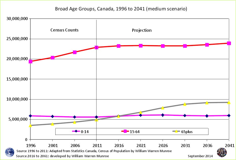
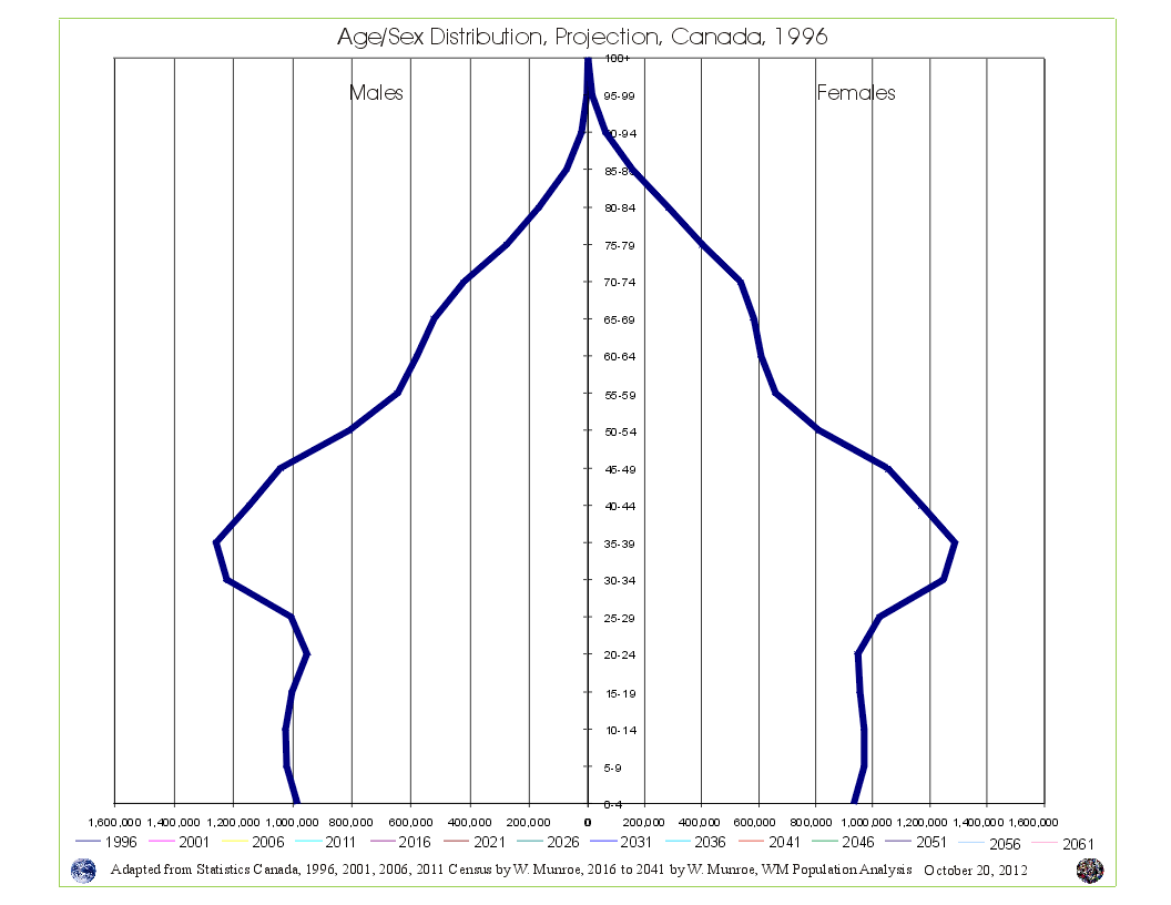 Take a look at Canada's Age Sex Distribution animated projection (medium scenario). The animation starts at 1996 and clicks through to 2041. Notice in the 1996 chart, the baby boom bulge (which is just the resumption of more births than deaths - the population pyramid - after WW2) followed by fewer numbers in the younger age groups reflecting (resulting from) reduced fertility beginning in the mid 1960s. This medium scenario projection is an average of the 1996 to 2011 cohort change ratios thus creating a central tendency that eventually provides smooth lines in the younger age groups by the end of the projection period.
Why are Statistics Canada's projections so high compared to the United Nations and the Cohort Change Ratios projections? Read Why so different?
Government population projections for BC reflect an "up and to the right" aspiration, while the cohort change ratios method shows BC's population growth slowing, and levelling out. Read a "A Comparison of Population Projections for BC"...