In an effort to explain why the Qualicum District's population is forecast to increase by over 30% to the year 2030, the BC Ministry of Health representative suggested, in 2013, longer life expectancy was the reason. Really?
Curiously, the chart the government representative provided was created prior to the release of the 2011 census results. Also, of course, longer life expectancy does not result in an increase in population, it only delays a decline. In 2014 the provincial official statistical agency estimated that in 2013 the population of the Town of Qualicum Beach declined. What's going on?
Let's take a look at the change in the number of 80 to 84 year olds for the Town of Qualicum Beach (not the District) compared to the Canadian average.

How do we check to see whether the Qualicum District residents live longer than most Canadians, helping to keep the population increasing by over 30%? One way is to look at the number of people who died by their age; however, getting death by age numbers is not always easy (yet) for Canadians.
Another way is to look at the change in the number of people, particularly for those in their late 70s and into their 80s, comparing Qualicum Beach with Canada as a whole.
What was the percent change between the number of people 75 to 79 years of age counted in one census compared to the number of 80 to 84 year olds counted in the next census for Canada as a whole? Between 1996 to 2001 (-24%); 2001 to 2006 (-21%); and 2006 to 2011 (-20%). Canada's average percent change between 1996 and 2011 was -21.5%. The average for Qualicum Beach between 1996 and 2011 was also -21.5% even though the percent change ranged more widely between each census due in part to the relatively small numbers.
This method (the cohort change ratios - CCR) shows a similar average ratio of more death and out-migration than in-migration for both Canada and Qualicum Beach. Also, CCRs better shows the impact of the population change in older age groups which in turn may keep the total population from declining as suggested by the medical health officer.
With only three census periods with which to check (1996 to 2011 are available on the census website, URL/address below), it is difficult to have confidence in saying there is a stronger trend towards longer life in Qualicum Beach; therefore, the 2016 census will be helpful to look at when it arrives in 2017.
1 The chart pretending to foretell the future.
2 Statistics Canada provides age and sex counts for 1996, 2001, 2006, and 2011 for Canada's census (dissemination) areas; therefore, the projections do not benefit from censuses prior to 1996, rather they use only recent trends, providing approximations of fertility (0 to 4 relative to Females 20 to 39 year old), life expectance ('survival ratios' to use the UN term for 'cohort change ratios'), and net migration by five year age groups.
To download census counts go to: Statistics Canada's website at http://www12.statcan.ca/census-recensement/index-eng.cfm. Be sure to read the footnotes and check for important information such as boundry changes, and non-response.
Population Projection Project for Canada's Census Areas
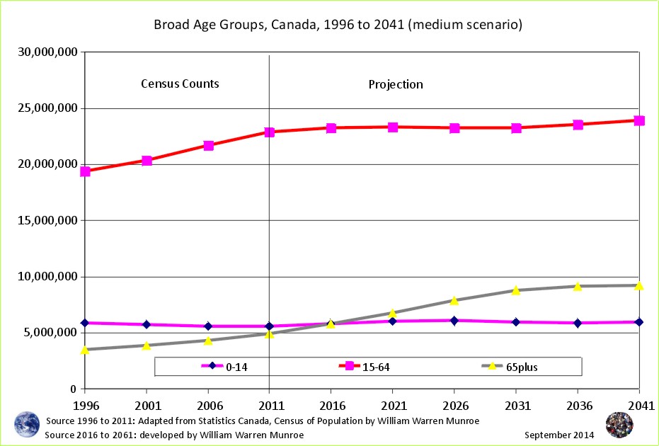
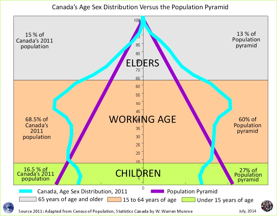
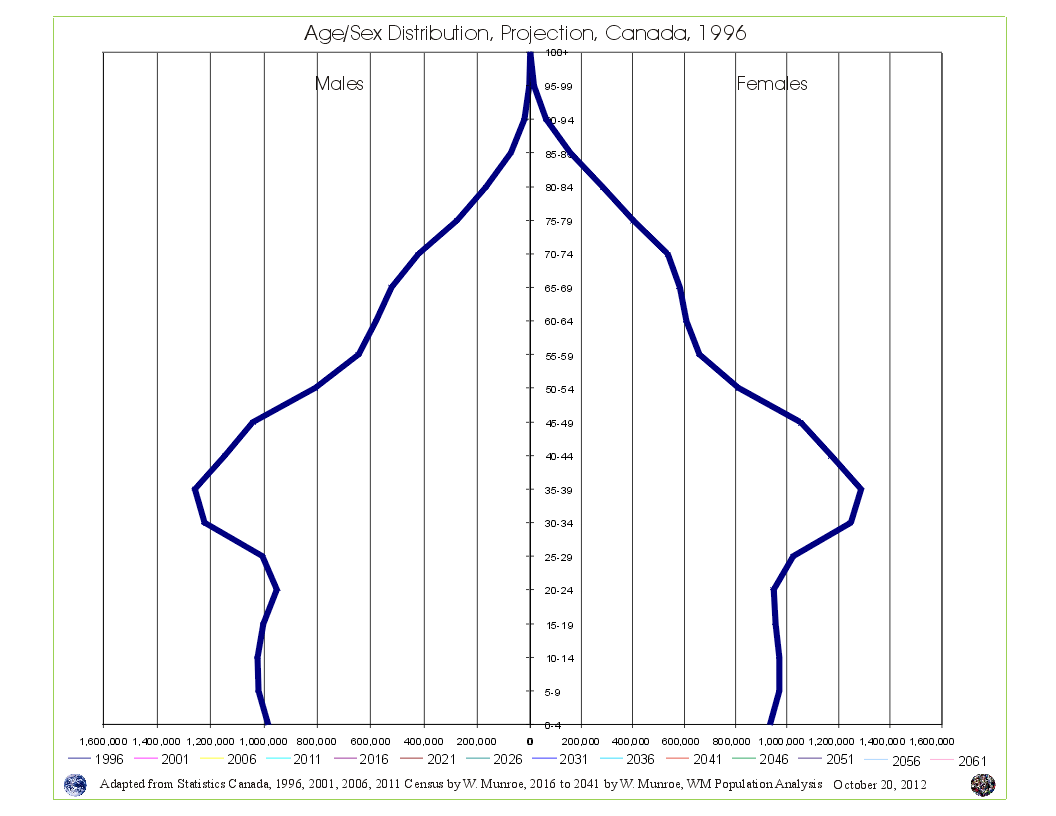 Take a look at Canada's Age Sex Distribution animated projection (medium scenario). The animation starts at 1996 and clicks through to 2041. Notice in the 1996 chart, the baby boom bulge (which is just the resumption of more births than deaths - the population pyramid - after WW2) followed by fewer numbers in the younger age groups reflecting (resulting from) reduced fertility beginning in the mid 1960s. This medium scenario projection is an average of the 1996 to 2011 cohort change ratios thus creating a central tendency that eventually provides smooth lines in the younger age groups by the end of the projection period.
Why are Statistics Canada's projections so high compared to the United Nations and the Cohort Change Ratios projections?
Government population projections for BC reflect an "up and to the right" aspiration, while the cohort change ratios method shows BC's population growth slowing, and levelling out. Read a "A Comparison of Population Projections for BC"...