On average, Canadians are living longer than ever before. But will life expectancy continue to increase? Let's take a look the 1996, 2001, 2006 and 2011 censuses to see if they can shed light on this demographic trend.
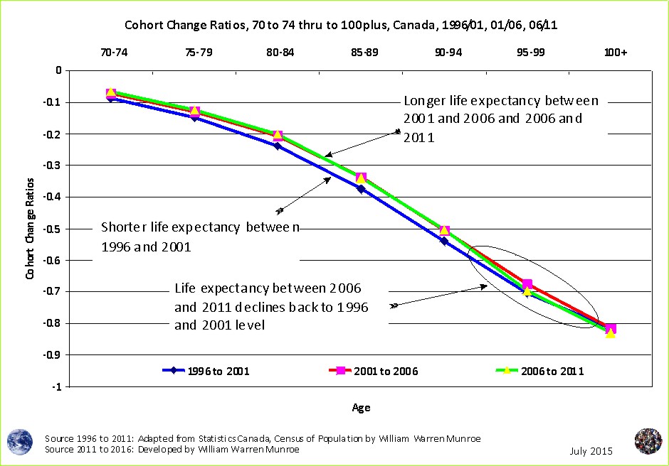
In particular, let's look at the differences between each 5 year age group from one census, and the next 5 year age group from the next census for people 70 years of age and older. For example, we see that ~15% of the 70 to 74 year olds counted in 1996 did not make it to the 75 to 79 year age group resulting from more death and and out-migration than in-migration.
Of the 75 to 79 year olds counted in 1996, there were 24% fewer 80 to 84 year olds counted in the 2001 census; however, between 2001 and 2006, this percentage was 20.5%, and was 20% between 2006 and 2011.
We see the cohort change ratios for the 1996 to 2001 census period (the blue line) shows a shorter life than for the later census periods (the green and red lines) indicating that since 2001 people lived longer.
What does this mean? The 2011 census results suggests that people may have reached their longevity limit - the increase in life expectancy has come to an end at least for now. The idea is that no matter how much goodness there is (including surgery, chemo, and radiation?) people can only live so long. Interestingly, during the 2006 to 2011 census period, the 90 to 95 year olds cohort change ratio slipped back into the shorter life zone seen in the 1996 to 2001 census period. What happened? The 2016 census results will be interesting to see.
What do you think about life expectancy for Canadians?
1
To download census counts go to: Statistics Canada's website at http://www12.statcan.ca/census-recensement/index-eng.cfm. Be sure to read the footnotes and check for important information about possible changes from one census to the next.
To learn how the projections are created visit the Population Projection Project Education tab.
Population Projection Project for Canada's Census Areas
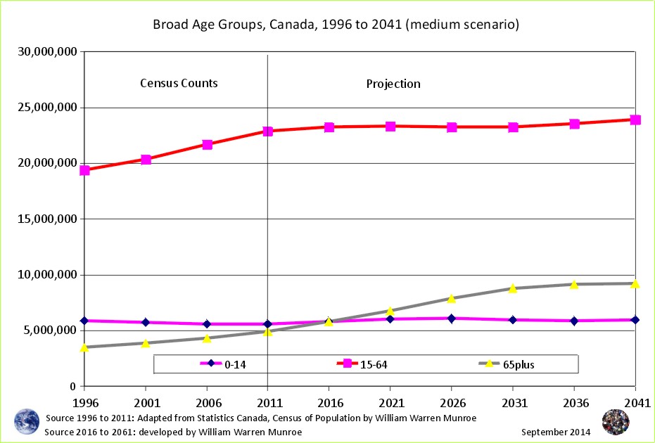
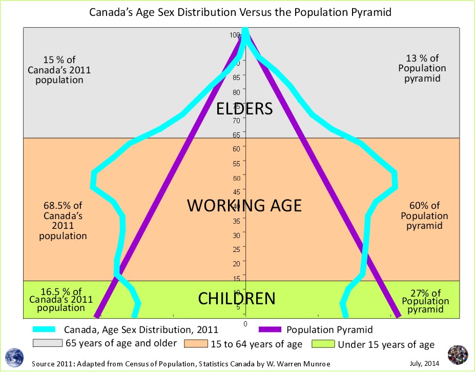
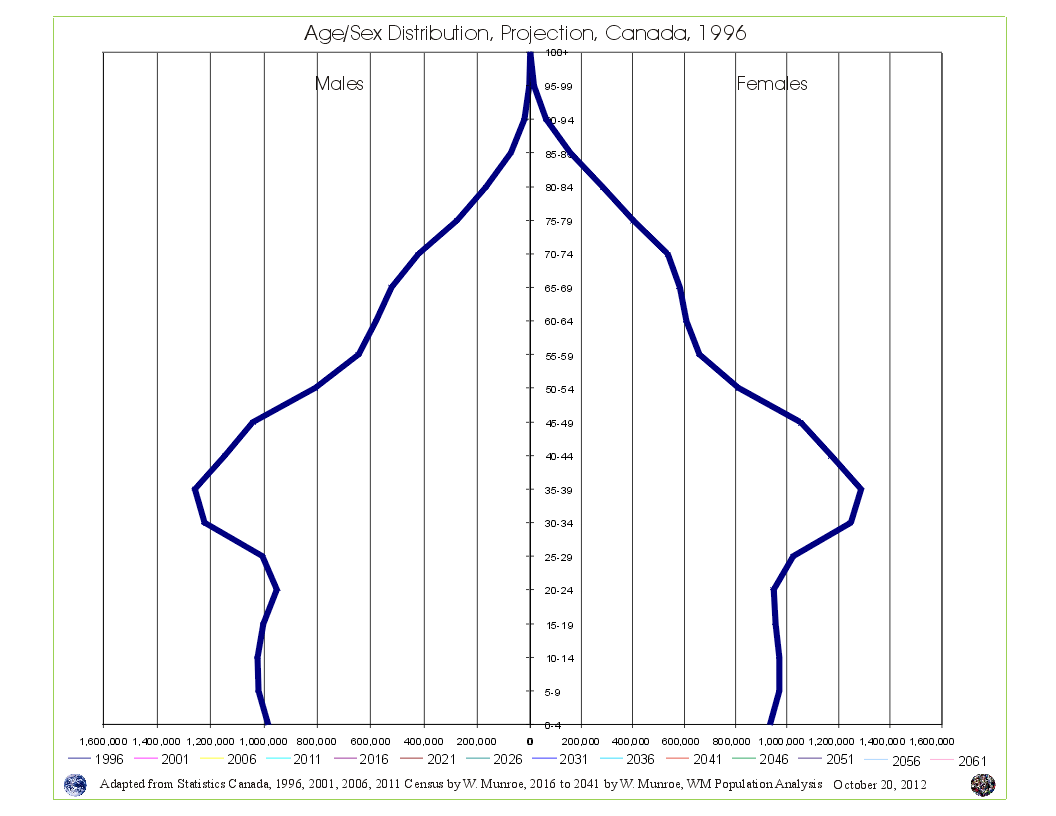 Take a look at Canada's Age Sex Distribution animated projection (medium scenario). The animation starts at 1996 and clicks through to 2041. Notice in the 1996 chart, the baby boom bulge (which is just the resumption of more births than deaths - the population pyramid - after WW2) followed by fewer numbers in the younger age groups reflecting (resulting from) reduced fertility beginning in the mid 1960s. This medium scenario projection is an average of the 1996 to 2011 cohort change ratios thus creating a central tendency that eventually provides smooth lines in the younger age groups by the end of the projection period.
Why are Statistics Canada's projections so high compared to the United Nations and the Cohort Change Ratios projections? Read Why so different?
Government population projections for BC reflect an "up and to the right" aspiration, while the cohort change ratios method shows BC's population growth slowing, and levelling out. Read a "A Comparison of Population Projections for BC"...