Some Canadian municipalities have more children and elderly than the number of people of working age. Let's compare the dependency ratios for Canada, BC, Ft.St. John, Hope, and Qualicum Beach. Here's what they look like.

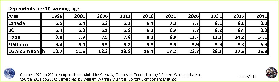
The Canadian average declined from 6.5 dependents per 10 people of working age in 1996 to 6.1 in 2011, similar to BC, but much higher than Ft St John. Hope's dependency ratio is higher than that of Canada and BC while Qualicum Beach, Canada's oldest municipality (in terms of median age), dwarfs all with dependency ratios 3 times higher than the Canadian average.
What will the communities with more dependents than people of working age be like? Few people of working age will likely mean that the elderly will have to provide the services that they can. I suggested at a chamber of commerce presentation in 2008 that some may even do their own roof repairs to which a elected representative thought not; however that summer I saw an elderly couple re-roofing their home themselves.
I suggested that efforts should, or perhaps could, be made to encourage a well rounded - more even - age distribution; however, others countered that municipalities should do what we are good at. For Qualicum Beach this would mean specializing in attracting even more retirees - go figure.
What do you think things will be like and could / should be done?
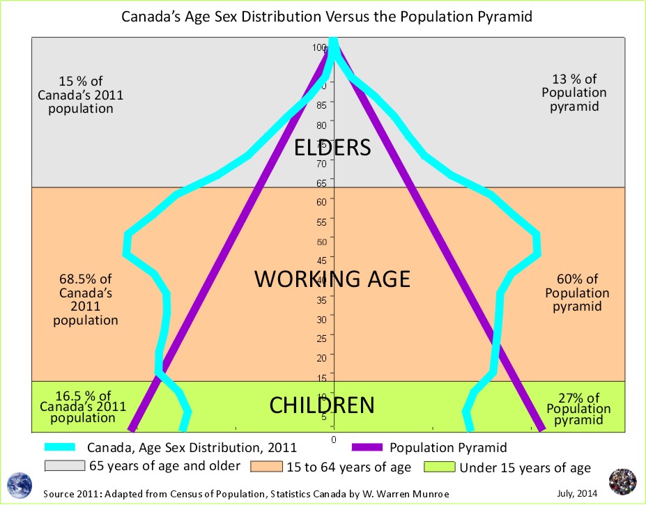
1 Working age here is made up of 15 to 64 year olds.
Statistics Canada provides age and sex counts for 1996, 2001, 2006, and 2011 for Canada's census (dissemination) areas; therefore, this projection scenario does not benefit from censuses prior to 1996, rather they use only "current" trends, providing approximations of fertility (0 to 4 relative to Females 20 to 39 year old), life expectance ('survival ratios' to use the UN term for 'cohort change ratios'), and net migration by five year age groups.
To download census counts go to: Statistics Canada's website at http://www12.statcan.ca/census-recensement/index-eng.cfm. Be sure to read the footnotes and check for important information such as boundary changes, and non-response.
To learn how the projections are created visit the Population Projection Project Education tab.
Population Projection Project for Canada's Census Areas
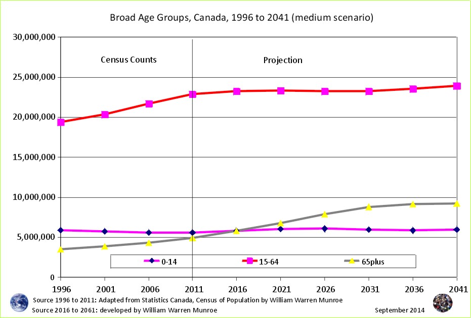
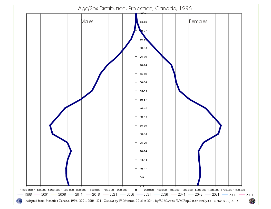 Take a look at Canada's Age Sex Distribution animated projection (medium scenario). The animation starts at 1996 and clicks through to 2041. Notice in the 1996 chart, the baby boom bulge (which is just the resumption of more births than deaths - the population pyramid - after WW2) followed by fewer numbers in the younger age groups reflecting (resulting from) reduced fertility beginning in the mid 1960s. This medium scenario projection is an average of the 1996 to 2011 cohort change ratios thus creating a central tendency that eventually provides smooth lines in the younger age groups by the end of the projection period.
Why are Statistics Canada's projections so high compared to the United Nations and the Cohort Change Ratios projections? Read Why so different?
Government population projections for BC reflect an "up and to the right" aspiration, while the cohort change ratios method shows BC's population growth slowing, and levelling out. Read a "A Comparison of Population Projections for BC"...