Global fossil fuel production increases, resulting from fracking and the removal of production limits from the OPEC nations, have impacts on the population of local areas such as Fort Saint John British Columbia.
Lower prices for exports have resulted in a down turn in economic activity, slowing in-migration, and increasing out-migration particularly for young adults moving to and from the northeast corner of the province of British Columbia.
Booms and busts in economic activity make understanding where we are and where we are heading on current demographic trends, and planning public and private services delivery, to say the least, difficult. How will the slowing resource extraction impact the total population as well as the number of people using public and private services including health and education facilities?
One way to find out what the future may hold is to look at the population changes over the last 20 years, a time period that includes both booms and busts. Of particular interest are the population projections (continuous boom or continuous bust and in between) as well as the coming changes for particular age groups, such as the number of children entering elementary school. We will find that Ft. St. John has a history of high turn over of young adults but a relatively stable population of baby boomers aging in the area.
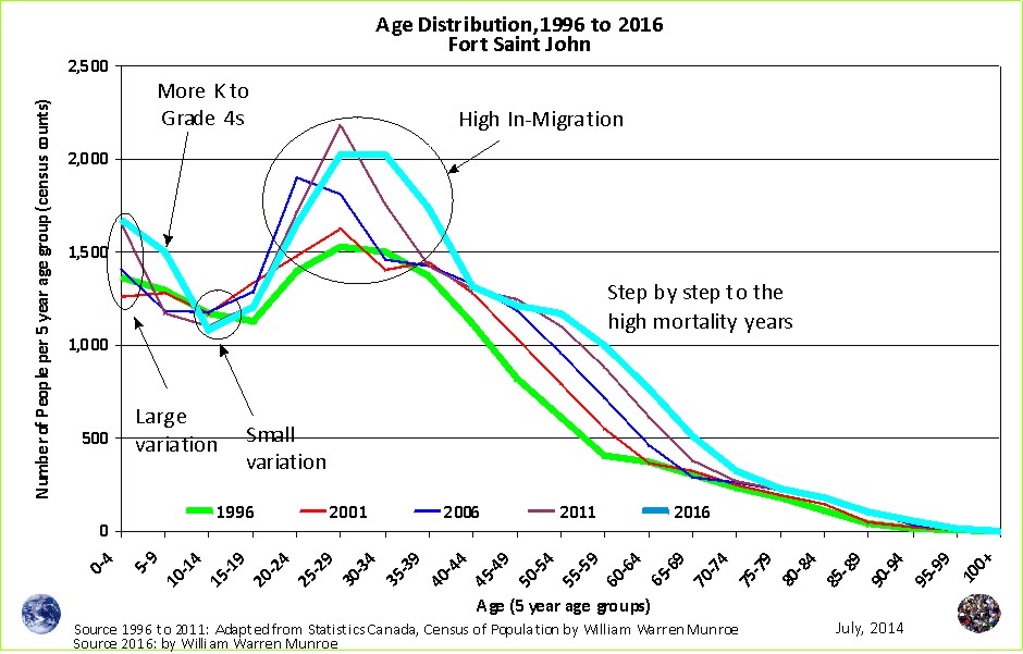
Let's take a look starting with the changes in the age distribution since 1996.
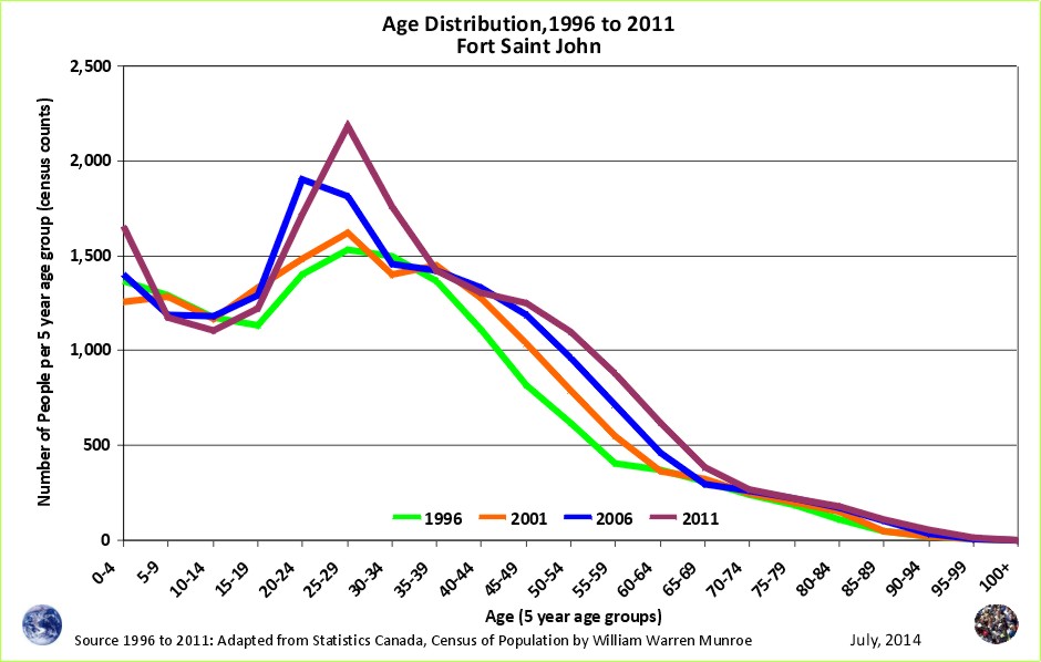
The chart above shows a high proportion of young adults, the age group that continues to increase from one census to the next; however, the number of those in their late 30s and early 40s is much lower than if no one moved out. On the other hand, the baby boomers are marching neatly into old age. What is interesting about this age group in this area is that the social network should be stronger than for the transient younger age groups; therefore, long lasting relationships, clubs, special interest groups such as arts clubs should have a large portion of boomers in attendance.
The youngest age group, those 0 to 4 years of age, shows a large increase between 2006 and 2011. This age group is now entering elementary school resulting in the need for more class rooms and teachers. Well informed understanding of demographic trends would be helpful during facility reviews.

Now lets take a look at the population signatures.
The population signature for Ft. St. John between 1996 and 2001 (Figure 2) shows more out-migration and death than in-migration for all the age groups except for those 15 to 29 years of age.
The oil and gas exploration and extraction provided some incentive for young adults to move to the area.
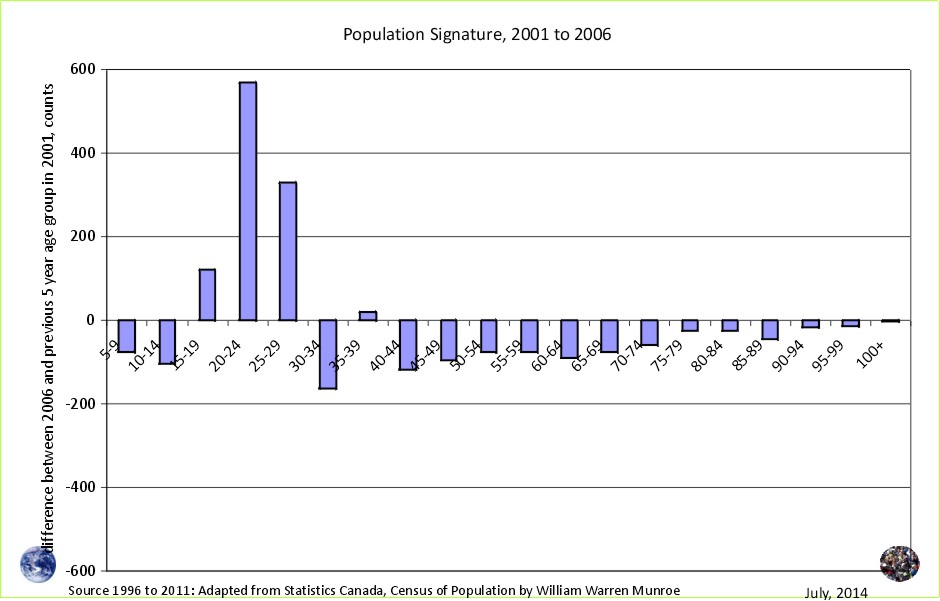
In Figure 3, we see the population signature for 2001 to 2006, having a similar pattern to Figure 2 except there were more people in their late 30s moving in and there were even more young adult in-migrants than during the previous census period.
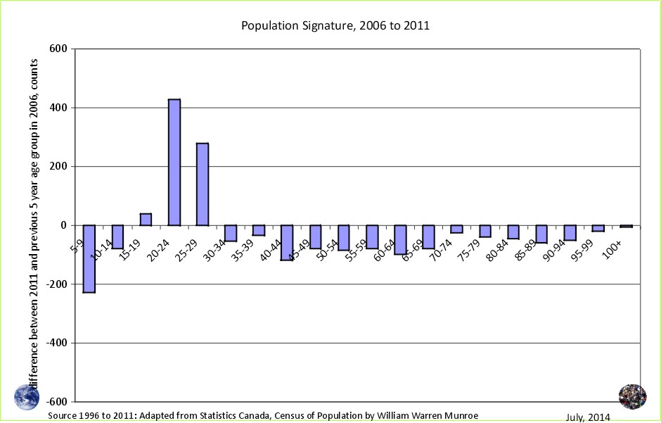
The pattern is repeated in Figure 4, however, the number of young adult in-migrants cooled marginally, between the lower values in Figure 2 and the higher values in Figure 3. Natural gas prices had dropped from the highs in 2008.
The charts show a similar amount of out-migration (and death) of people in the older age groups from one census to the next; however, take a look at the 5 to 9 age group. Families (5 to 9 year olds and their parents) are not attracted to the area as more move out than move in.
If the bust experienced now results in low growth, similar to the low growth between 1996 and 2001, we can project what the future will look like, but what if the down turn is greater than was experienced during any census period since 1996? We can always create a forecast with clearly explained assumptions and methods. To do this, all we would need to do is lower the in-migration of young adults (15 to 29 years of age) and raise out-migration of all other age groups.
For now though, let's take a look at the medium population projection scenario for those 5 to 9 years of age created using cohort change ratios based on census counts since 1996. Of course we should see a strong increase in this age group reflecting the increase in 0 to 4 year olds seen between 2006 and 2011.
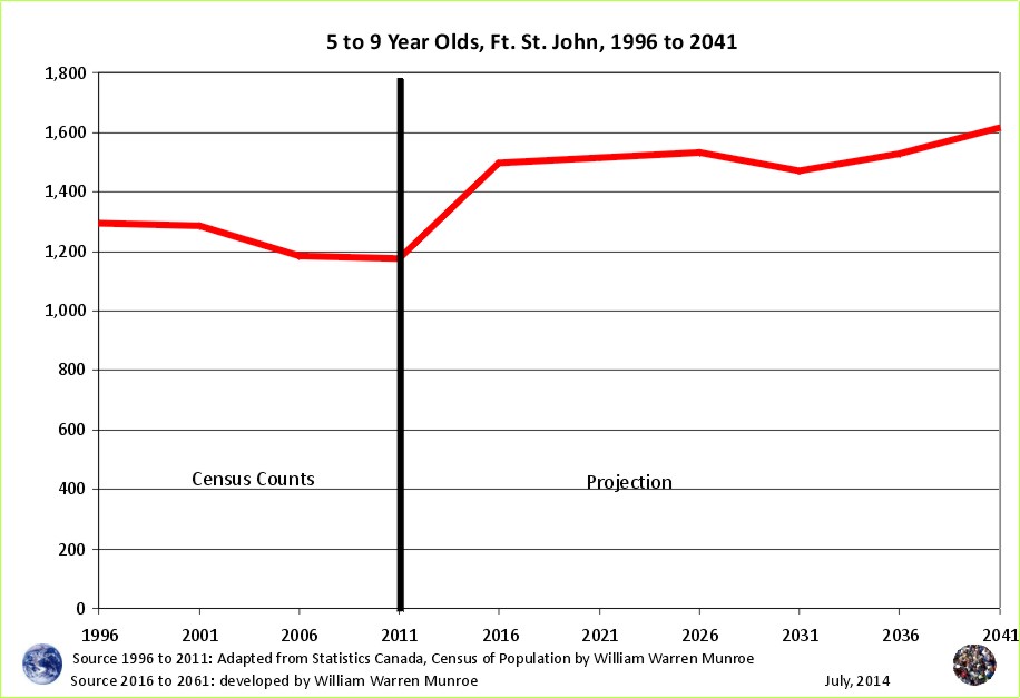
Here they come. The reaction from Victoria bureaucrats to the decline in economic activity at the same time that elementary school enrolment increases should be interesting. The Capital Regional District, the Northern Rockies, and the Peace River Regional District had the highest average income in the province in 20052. This is interesting because high income in a bureaucratic town relative to other areas usually occurs only during down times. During boom times the resource extraction areas usually have higher incomes, but not so in British Columbia where the bureaucrats in Victoria have high income during boom times and bust times. It should be interesting to see the enrolment numbers next fall and to see whether an effort is made by Victoria to withhold funds to Ft. St. John schools during the economic down turn even though elementary school enrolment is likely to continue to increase.
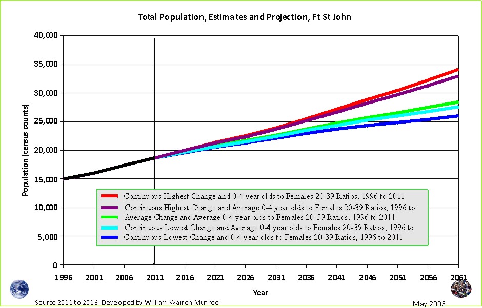
The population projections based on current trends reflected in the population change between 1996 and 2011 all show an increase in population for Fort Saint John. Even the lowest population increases between 1996 and 2001, if repeated continuously, would result in increased population.
For the total population to decrease in the future, the in-migration of young adults would have to be lower, and slower and the out-migration in all other age groups higher and faster, than was experienced during any of the census periods since 1996.
Let's take a look at the medium scenario projection of the age distribution for 2016.
If the average change experienced between 1996 and 2011 were to continue into 2016, we should see the number of young children increasing while the number of young adults remains around the same.
Of particular interest is the increase in the number of 35 to 44 year olds. If current trends continue, Ft. St. John will have more people in this age group than ever before. What do you see? The results from the next census in 2016 should be interesting!
1 Statistics Canada provides age and sex counts for 1996, 2001, 2006, and 2011 for Canada's census (dissemination) areas; therefore, this projection scenario does not benefit from censuses prior to 1996, rather they use only "current" trends, providing approximations of fertility (0 to 4 relative to Females 20 to 39 year old), life expectance ('survival ratios' to use the UN term for 'cohort change ratios'), and net migration by five year age groups.
To download census counts go to: Statistics Canada's website at http://www12.statcan.ca/census-recensement/index-eng.cfm. Be sure to read the footnotes and check for important information such as boundary changes, and non-response.
2 Income and Housing in Canada, by William Warren Munroe, June 2008
Population Projection Project for Canada's Census Areas
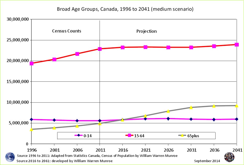
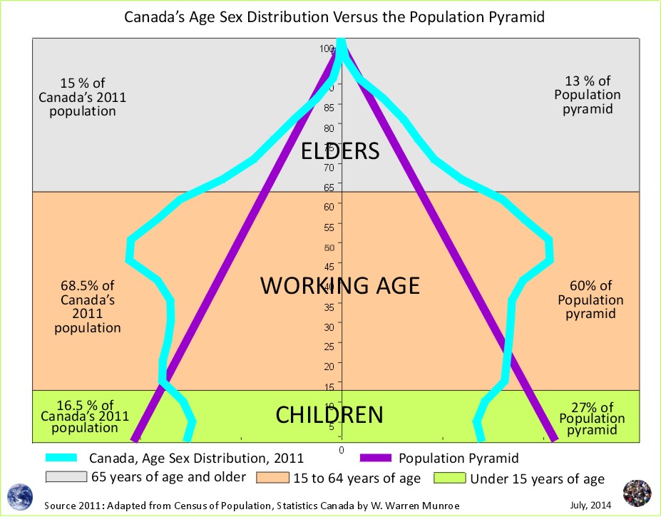
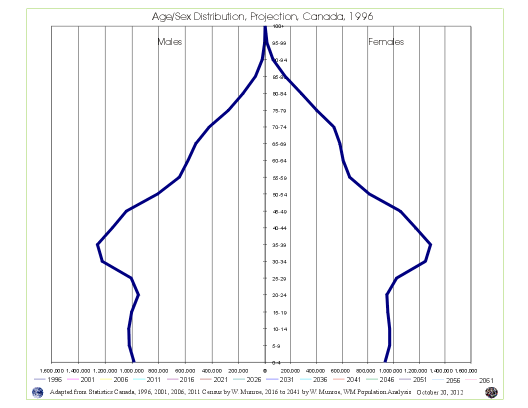 Take a look at Canada's Age Sex Distribution animated projection (medium scenario). The animation starts at 1996 and clicks through to 2041. Notice in the 1996 chart, the baby boom bulge (which is just the resumption of more births than deaths - the population pyramid - after WW2) followed by fewer numbers in the younger age groups reflecting (resulting from) reduced fertility beginning in the mid 1960s. This medium scenario projection is an average of the 1996 to 2011 cohort change ratios thus creating a central tendency that eventually provides smooth lines in the younger age groups by the end of the projection period.
Why are Statistics Canada's projections so high compared to the United Nations and the Cohort Change Ratios projections? Read Why so different?
Government population projections for BC reflect an "up and to the right" aspiration, while the cohort change ratios method shows BC's population growth slowing, and levelling out. Read a "A Comparison of Population Projections for BC"...