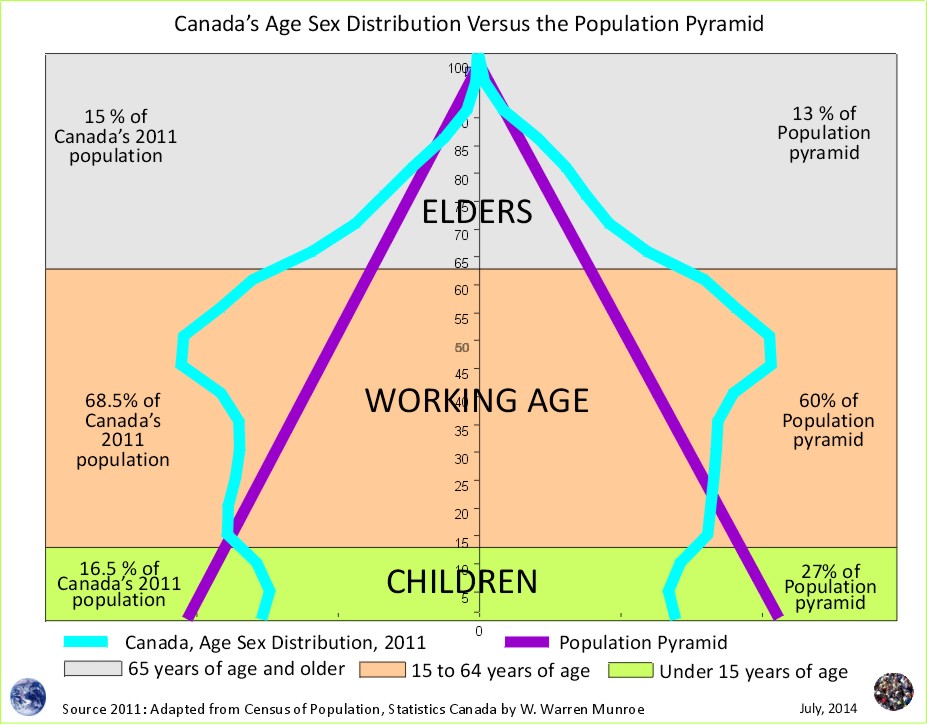
In the previous article, Canada Versus the Population Pyramid, the proportions (percentage of total population) of children, elders, and those of working age for Canada were compared to those of a population pyramid.
In this article, the ratio of dependents (children and elders) per 10 people of working age in Canada is compared to the ratio of dependents per 10 people of working age for a population pyramid. What does the future look like if current (1996 to 2011) demographic trends continue through 2016 to 2041? Lets take a look:
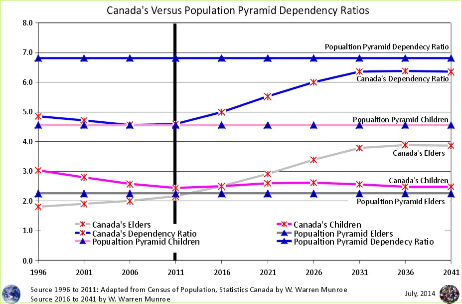
Within the population pyramid there are approximately 2.3 elders (65 years of age plus) per 10 people of working age, and approximately 4.6 children (under 15) per 10 people of working age for a total of just under 7 dependents (children plus elders) per 10 people of working age.
For Canada in 2011 there were 2.2 elders (65 years of age plus) for 10 people of working age, and 2.4 children (under 15) for 10 people of working age for a total of just 4.6 dependents (children plus elders) per 10 people of working age.
If Canada continues to meet it's current immigration quota of approximately 250,000 per year, and the international out-migration experienced between 1996 to 2011 continues into the future at a similar level, the population projection (medium scenario) dependency ratio will remain below that of the population pyramid dependency ratio to the year 2041.
1 The figures for 1996, 2001, 2006, and 2011 are adapted from Statistics Canada, 1996, 2001, 2006, and 2011 Census of Population counts, by William Warren Munroe.
Statistics Canada. 2012. Population and dwelling counts, for Canada, provinces and territories, 2011 and 2006 censuses (table). Population and Dwelling Count Highlight Tables. 2011 Census. Statistics Canada Catalogue no. 98-310-XWE2011002. Released February 8, 2012. http://www12.statcan.ca/census-recensement/2011/dp-pd/hlt-fst/pd-pl/File.cfm?T=101&SR=1&RPP=25&PR=0&CMA=0&S=50&O=A&LANG=Eng&OFT=CSV (accessed February 08, 2012). For further information, refer to: http://www12.statcan.gc.ca/census-recensement/2011/dp-pd/hlt-fst/pd-pl/Notes-eng.cfm.
The figures for 2016 to 2041 are developed using the cohort change ratios method based on the 1996, 2001, 2006, and 2011 Census of Population counts, medium scenario, by William Warren Munroe.
Population Projection Project for Canada's Census Areas
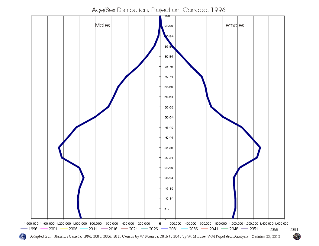 Take a look at Canada's Age Sex Distribution animated projection (medium scenario). The animation starts at 1996 and clicks through to 2041. Notice in the 1996 chart, the baby boom bulge (which is just the resumption of more births than deaths - the population pyramid - after WW2) followed by fewer numbers in the younger age groups reflecting (resulting from) reduced fertility beginning in the mid 1960s. This medium scenario projection is an average of the 1996 to 2011 cohort change ratios thus creating a central tendency that eventually provides smooth lines in the younger age groups by the end of the projection period.
Why are Statistics Canada's projections so high compared to the United Nations and the Cohort Change Ratios projections?
Government population projections for BC reflect an "up and to the right" aspiration, while the cohort change ratios method shows BC's population growth slowing, and levelling out. Read a "A Comparison of Population Projections for BC"...