Qualicum Beach provides an example of a municipality where the total population will likely decline as deaths and out-migration increasingly exceed births and in-migration.
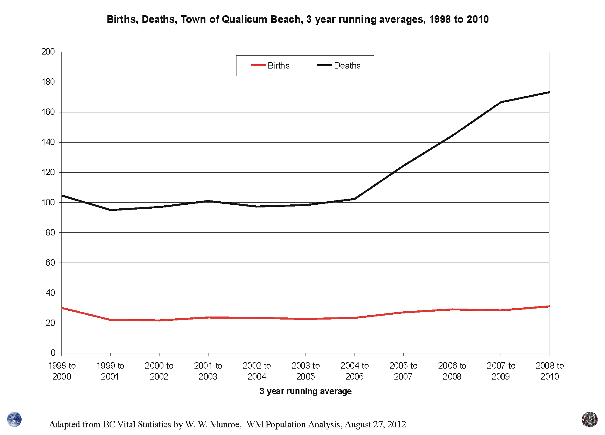
The three year running average chart shows the increasing difference between births and deaths; however, in 2005 QB's area expanded to include the ~900 people living in Chartwell.
If Chartwell was a part of QB between 1998 and 2005, the number of deaths would have been approximately ~ 10 to 15 higher. The number of births would have been ~ 2 to 3 higher.
Nonetheless, the ratio of deaths to births is approaching 6:1.
For a closer look, click on the chart and use the back button to return to this page.
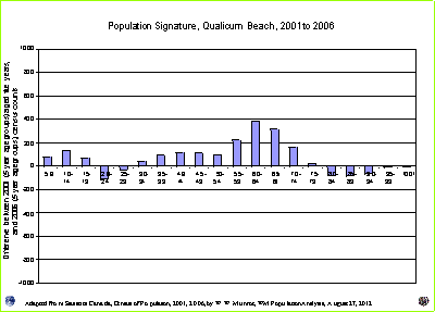
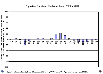
Another way to see if there are increases in mortality, is to look at the Population Signature for QB using the census counts from Statistics Canada. Move your cursor over the following chart and look at the older age groups. For larger charts, click the little charts in the left navigation bar.
Population Signatures can show us population change by broad age groups. We can see whether more families (children - 5 to 15, and adults - 30 to 50 years of age), as well as, young adults (20 to 29) and retirees (55 to 75), move in than out between one census year and the next.
The Population Signatures for the Parksville Census Agglomeration (which includes Parksville, the Town of Qualicum Beach and Area F including Chartwell) also shows the reduced net migration as the economic activity slowed between 2006 and 2011.
Click this link for the Population Signatures between 1996 to 2001 and between 2001 to 2006.
During the economic downturn, fewer families and even retirees moved in than out, while more young adults moved out than in between 2006 and 2011 compared to 2001 to 2006.
In 2004, I, along with other Economists working for BC's provincial government, forecast the next downturn in economic activity to begin in 2008, give or take a year, varying by area as rural areas tend to get hit first, and hardest. As stated in previous articles, during the next economic downturn (the one we are in), the reduced net migration will likely not provide enough people to compensate for the rising number of deaths in the Parksville Qualicum area.
Since 1996 the median age has continued to rise moving ever closer to the high mortality years 70 plus. What will the age / sex distribution look like in the future?
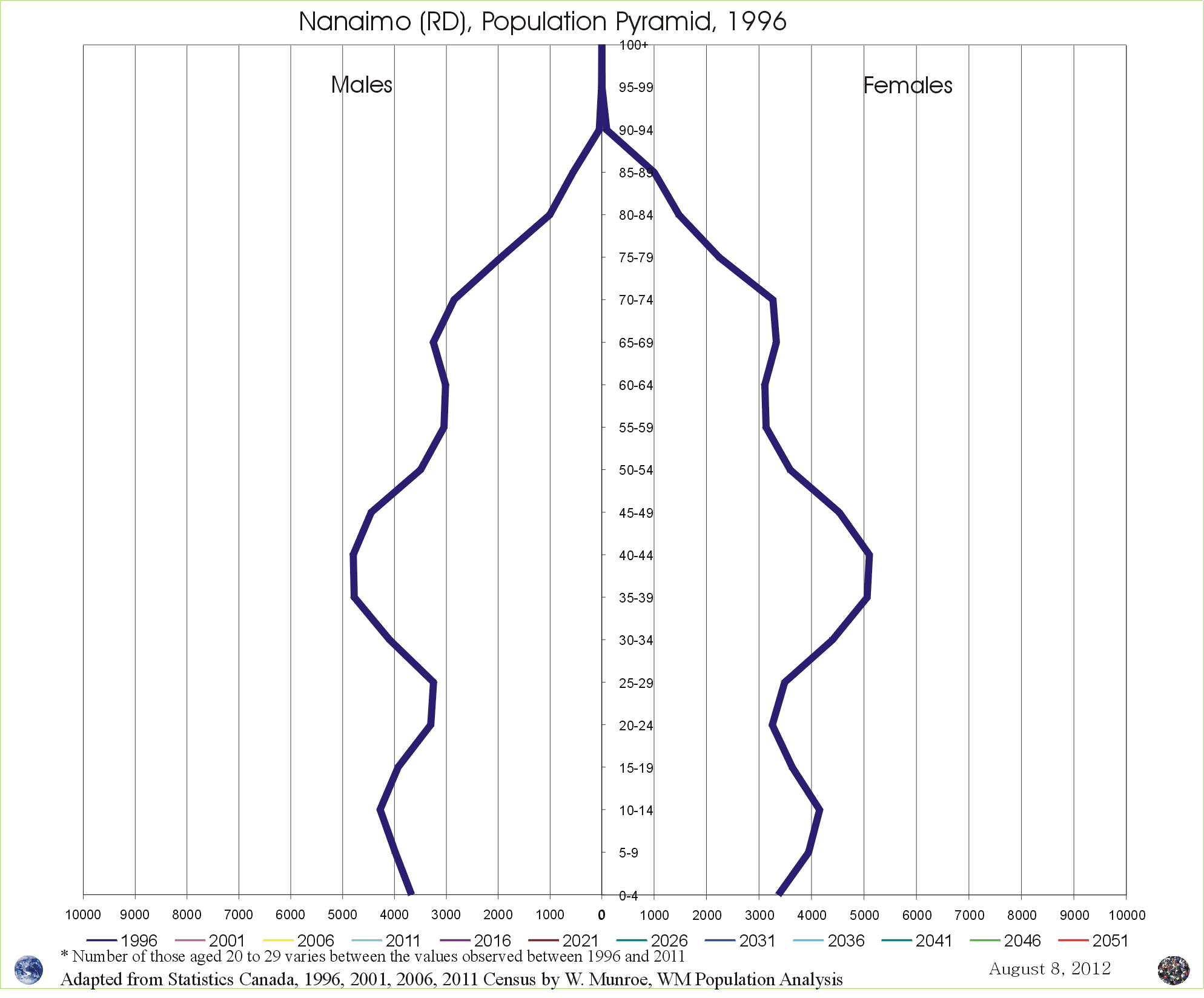
Figure 3 shows the age / sex distribution from the census counts since 1996. Notice the loss of adults of working age as they age out of the work force, and the aging of the elders. The number of children 0 to 4 years of age is dependent on the number of females 20 to 39 years of age. With the high out-migration of the 20 to 29 year olds and the relatively low number of in-migrants of the 30 to 39 year olds, unless more females move to and stay in Qualicum Beach, the number of children will likely remain low.
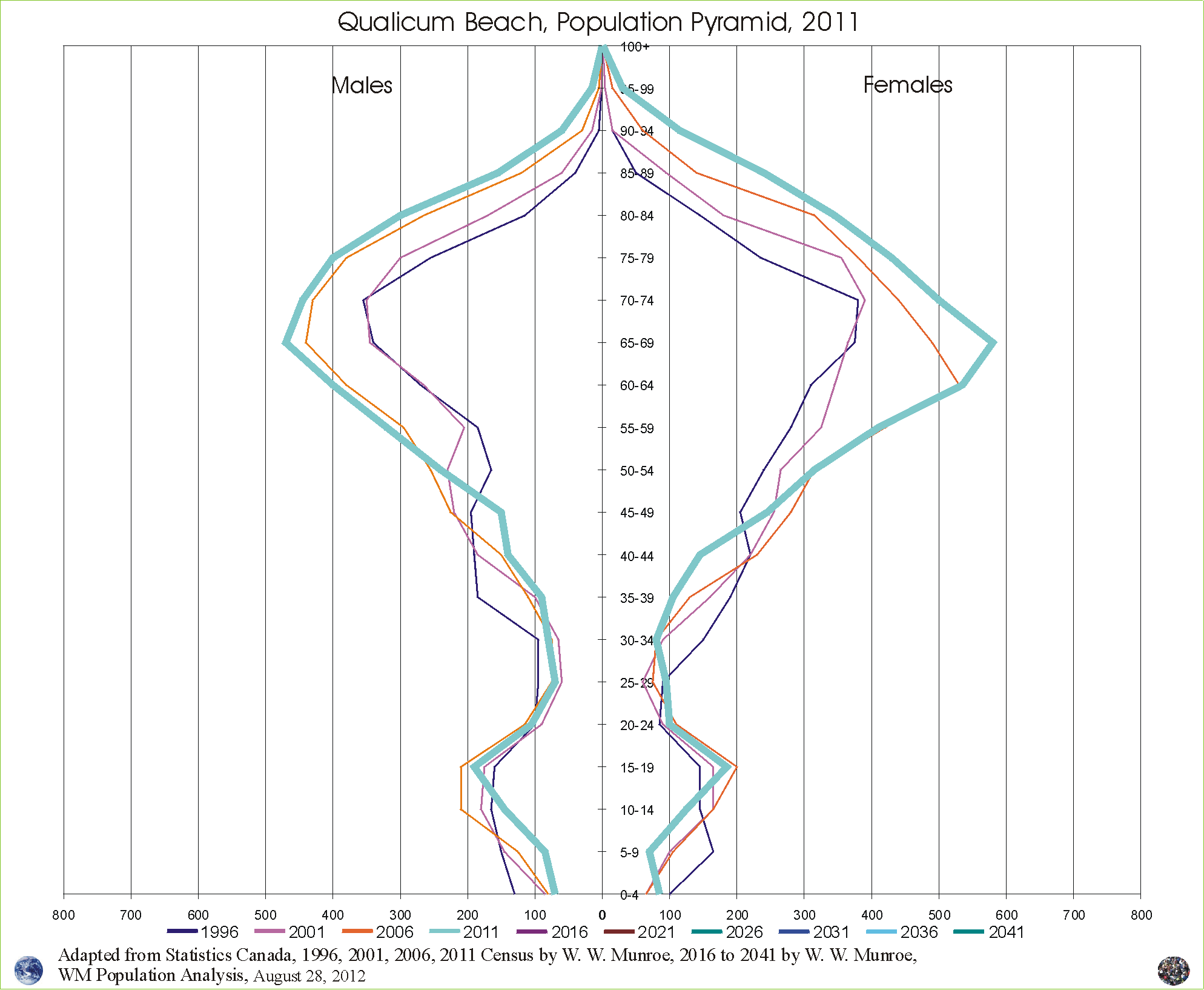
One of the oldest methods to project age / sex distributions is to use the cohort (five year age groups in this case) change ratios (see the note to readers below). Population Signatures are graphic displays of the cohort change.
If the average of the changes seen in the Population Signatures (the cohort change) between 1996 and 2011 continue to occur in the future, the future age / sex distribution will look something like the charts displayed in the animation ... click on Figure 3.
The average of the changes still shows more elders and families moving in than out while more young adults move out than in. Mortality, being one of the sure things, increases as citizens age.
When looking at the change between 2001 and 2006, you may notice the influence of the addition of Chartwell (~900 people) to Qualicum Beach. One way to address boundary changes is to see if the areas of interest belong to a Census Agglomeration (CA) or Census Metropolitan Area (CMA). If so, use the cohort change for the CA for the years when the boundaries changed. For this projection, the cohort change for Qualicum Beach was replaced with the cohort change for the Parksville Census Agglomeration which includes both Chartwell and Qualicum Beach. This topic is addressed more fully in a writeup of the presentation to the Parksville and Qualicum Beach Chambers of Commerce (January 2008) titled Global and Local Population Change.
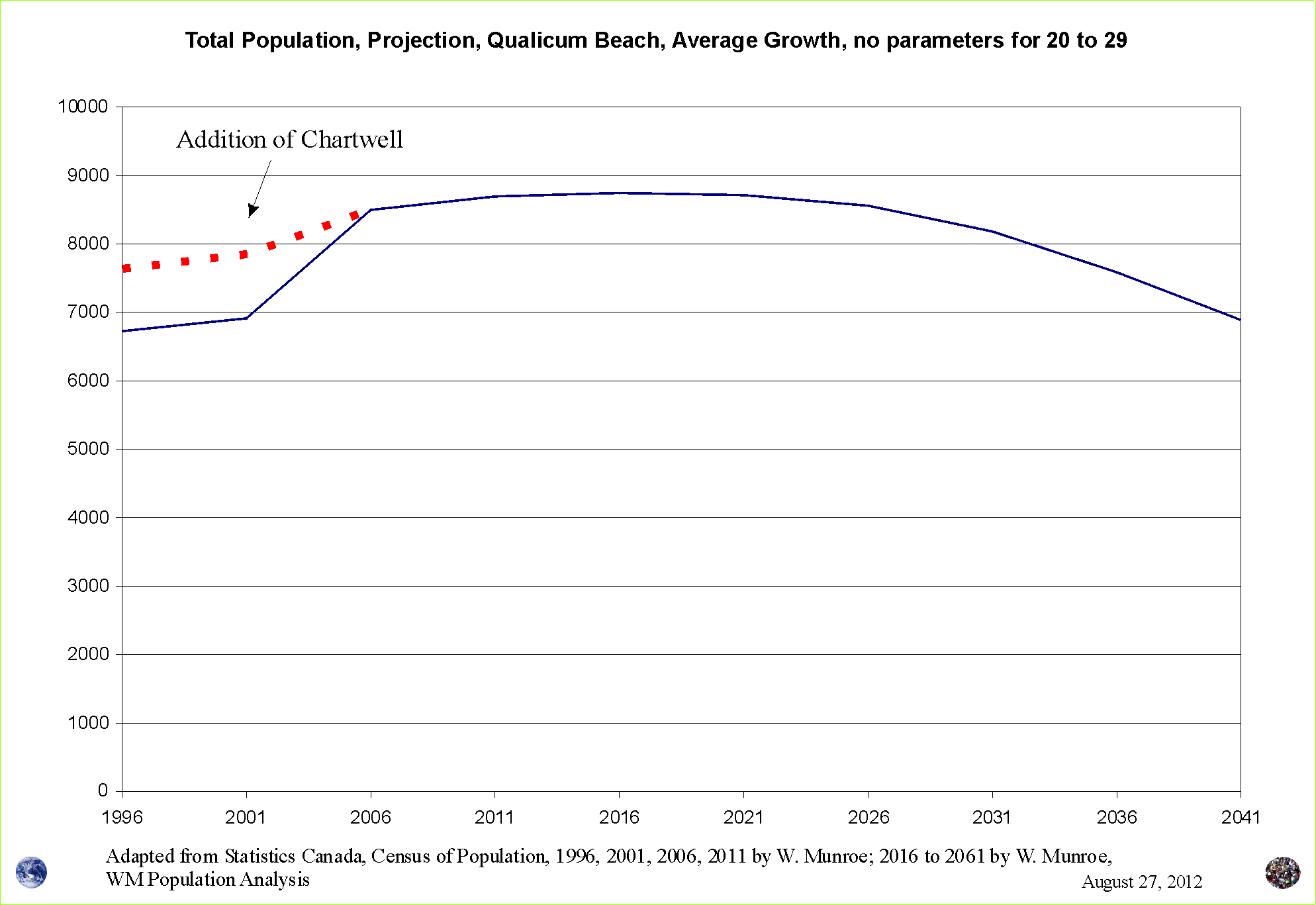
Using the average of the cohort change between 1996 and 2011, the projection seen in Figure #4 is created. We see that the total population has reached it's upper limits and will likely begin to decline over the next ten years.
This scenario provides a smooth line (a central tendency) as it does not take into consideration the impacts of economic cycles nor shocks such as rapid changes in access to energy. Also the rising fees for travelling using BC Ferries will likely reduce in-migration but is not taken into consideration in this scenario. Changing the assumptions can be done easily showing the impact of factors that influence migration, like ferry costs.
Nonetheless, this projection, referring to the changes seen between 1996 and 2011, provides insight into the changing character of Qualicum Beach. For example the dependency ratios, show that the number of dependents relative to the number of people of working age will likely continue to rise (Figure 6).

Economic cycles have an impact on migration as seen in Figure 2. These cycles are felt in our communities and therefore are important to consider. During down times, there is less demand for increased housing, lower prices, lower wages, while during "boom" times housing prices tend to rise.
When we take these cycles into consideration we can see the impact on population. Little wonder why some community members want to know about population change.

The low fertility along with the high out migration of young adults, along with the increasing mortality may result in relatively low prices for single family dwellings. Therefore, this area may become even more attractive to families. If so, we may see an increase in the total population in the future.
NOTE TO THE READER:
The method, used to create Figure 3 and 4, was developed to project/forecast age / sex distributions in an effort to meet the needs of people interested in being informed about issues that effect them and their communities.
Therefore the method has been described in a manner that is meant to be readily understood and easily applied. Remember, calculating population change is arithmetic ... births minus deaths (natural change) plus in-migration minus out-migration (net migration).
See the Service webpage for the write up "Population Projection Package"
The 2016 to 2041 projections are created by Warren Munroe with reference to the 1996 to 2011 census counts from Statistics Canada. Of course the future is open to variation; therefore, projections are still a guess, but at least, with reference to the 1996 to 2011 census counts, this projection can reasonably be considered an educated guess.
While this median scenario is based on the 1996 to 2011 census counts from Statistics Canada, the United Nations and Statistics Canada did not examine, test, review, comment nor contribute to Warren Munroe's projection numbers, 2016 to 2061; however, the method is open and available and verifiable and reproducible.
Thank you to DAVE BRYAN for sponsoring the population analysis, with projections, for Qualicum Beach. Dave's vision and foresight are an example of what it takes to make informed decisions.
1 Source: Adapted from BC Vital Statistics by W. W. Munroe
2 Source: Adapted from the 1996 to 2011 census counts are from numeric tables from Statistics Canada found online via http://www12.statcan.ca/census-recensement/index-eng.cfm by W. W. Munroe
3 4 5 6 Source: Adapted from the 1996 to 2011 census counts from numeric tables from Statistics Canada found online via http://www12.statcan.ca/census-recensement/index-eng.cfm with projections, 2016 to 2041, by W. W. Munroe
For more information about population change, including economic cycles, impacts due to transportation (e.g. BC Ferry fees) send an email to wmpopulationanalysis@shaw.ca.
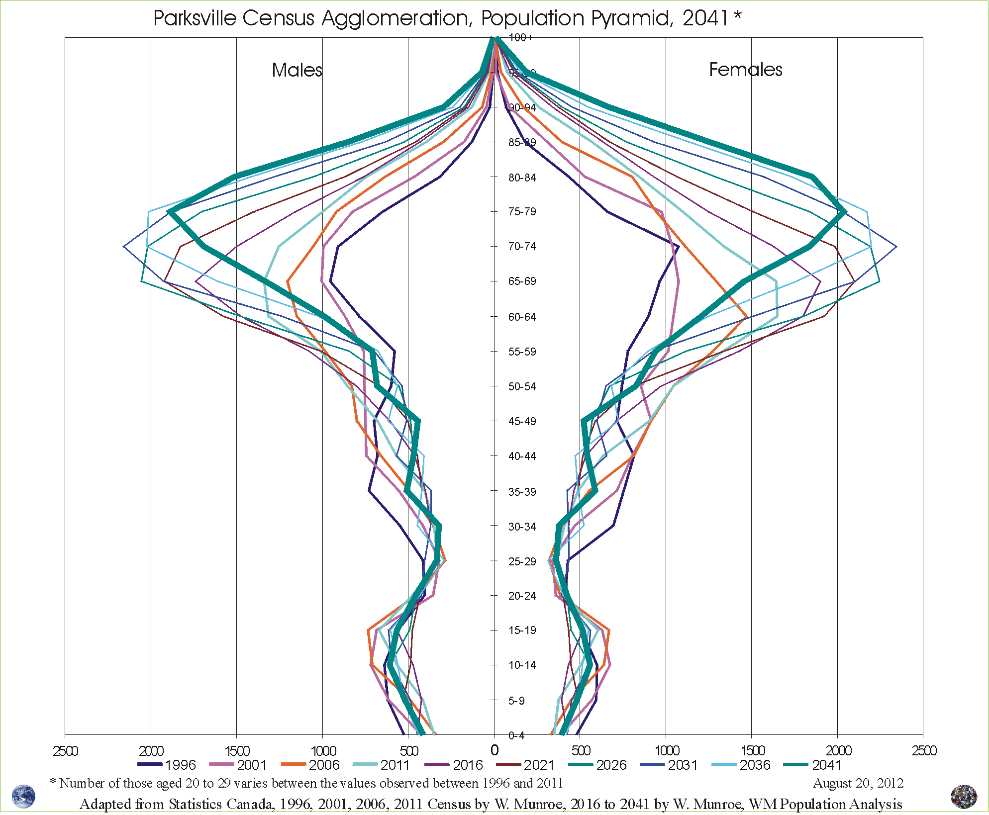
Parksville Census Agglomeration is one of the oldest, in terms of median age of residents, regions in Canada. What does the future look like?
While deaths continue to increase and births stay relatively low, below replacement, population can only increase with more in-migration than out-migration.
Read more ...
