The Population Projections Project was developed to provide community members with well-defined population projection scenarios for Canada's census areas, from the national to local levels.
Canadians have arguably one of the best sources of demographic data of any nation in the world with which to examine current local to national demographic trends; namely, the Census of Population conducted every five years, available from Statistics Canada's Census website.1
These instructions show how to examine current demographic trends revealed in the 1996 to 2011 Censuses of Population and how to calculate directly from these censuses several well defined population projection scenarios for 2016 to 2041 or later.


The 2016 projection scenarios can be compared to the actual 2016 census counts. How accurate were the 2016 population projection scenarios calculated directly from the 1996 to 2011 censuses compared to the actual 2016 census counts?
Although, accurate to within one percent of the actual counts, the projections merely tell us what the future will look like if current demographic trends continue (fertility, life expectancy, and migration by age and sex); therefore, they do not pretend to foretell the future - these are analytic constructs based on open data, that are as reliable and genuine as possible, using the clearly stated methods as described herein.
These instructions are designed for the Grade 11 Social Studies Demographics section, and are open to the public to provide an independent, non-partisan, objective, scientific, neutral reference with which "to consider the implications of alternative scenarios"2.
 and sex (males, females and totals) for each of the censuses, starting with 1996 to 2016")
Access Canada's Census of Population
Watch the video and follow the steps below: How to find, gather (download), and store 1996, 2001, 2006, and 2011 Census of Population counts (Video)
To create a table of discovery for a census area in Canada:
1) Go to Canada's Census of Population website.
2) Go to 1) Data Products, 2) Topic Based Tabulations, 3) Age Sex 4) Choose level of Geography (i.e. Canada, Provinces, Territories, Census Divisions, Census Subdivisions 5) HTML or B20/20
3) Download the census Age Sex counts for each of the previous censuses available on the internet - 1996, 2001, 2006, 2011
4) Sort each of the censuses age sex counts into 5 year age groups and bring into one table (a Table of Discovery).
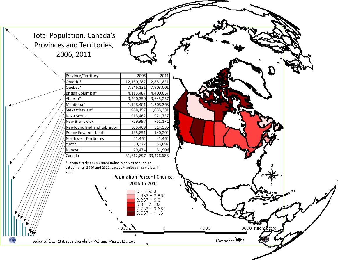
Here is a table of Canada's census counts by age and sex for 1996, 2001, 2006, 2011.
Age Distribution, 1996, 2001, 2006, 2011 Counts plus projection for 2016
Watch the video on How to calculate a population projection (average) scenario of the number of people by age directly from Canada's Census of Population.

Use the total population (males plus females) for each census year to create a chart of the age distribution. As seen in the charts to the right, the age distribution lines are very similar in shape from one census to the next, while showing the differences from one census to the next.3

Take a closer look at the shape of the lines. Can you see the age groups born during the great depression and the WWII? Can you see the baby boomer? What about the boom bust echo? Can you see that people are living longer? When did below fertility replacement begin?
By comparing one census to the next we can also begin to see the impact of migration and mortality by 5 year age groups on the Canadian population.

While similar in shape, when we compare the number of those in one age group from one census with the number of those counted in the next age group (five year older) in the next census, we see there are differences.
If no one moved or died, the numbers would be the same; however, the numbers, (and lines in the chart), are different due to net migration and mortality.
Population Change Signatures

Take a look at the difference between the number of people counted in 1996, aged 5 years to compare with those counted in 2001 seen in the bar chart to the right. For example, the number of 0 to 4 year olds in 1996 are compared to the number of 5 to 9 year olds in 2001. The difference between the number of people from one age group compared to the next age group five years later is used to create the charts showing the Population Change Signatures, aka Population Signatures.
The only way that the bars on these charts can be above the centre "0" population line is if there is more in-migration than out-migration and death. The bars appear below the "0" line if there is more out-migration and death than in-migration.
This difference between what was expected (if nobody moved or nobody died) and what is observed in the Population Signatures (from one census to the next census - every 5 years in Canada) provides the cohort change ratios (CCRs) used to calculate the projections.
 The table to the right shows how the CCRs are calculated using the Town of Qualicum Beach as an example of small population areas.
The ratio in the last column can be multiplied by 100 to give a percent change from one census to the next. For example, the number of 5 to 9 year olds counted in 2001 had increased 6.5% from the number of 0 to 4 year olds counted in 1996. This increase was due to more in-migration than out-migration and deaths.
")
Child Women Ratios
Projecting 0 to 4 year olds is done by looking for possible relationships with the number of females of reproductive age. This could be for any of the five year age groups between 15 and 49. For example, 25 to 34 year olds or 20 and 39, or for a specific 5 year age group such as 30 to 34 years of age.

This project began using 20 to 39 years of age because this age group had the strongest correlation with the 0 to 4 year olds for the province of British Columbia (where this project began); however 15 to 44 years is traditionally referred to as child bearing age and is often used as well.
We find that as the number of females of child bearing age increases or declines, so does the number of young children (0 to 4) increase and decline respectively. Nonetheless, there is some variation in the ratio of children 0 to 4 to females age child bearing age which is helpful to consider.
The ratio of the number of children to females of child bearing age is referred to as Child Women Ratios (CWR).
As we know, from learning about demographic trends by looking at the census results, the number of females of reproductive age fluctuates. The result of this fluctuation is referred to as boom, bust and echo.
The Child Women Ratios (CWR) with the lowest ratio is used for the low scenario, the average ratio as the medium scenario and the high CWR is used as the high scenario.

Age/Sex Distribution Projections*
are calculated using the Cohort Change and Child Women ratios. Although the Average Growth Average Fertility scenario is most often referred to, several scenarios can be created. For example, high and low projections can be calculated, as well as scenarios that refer to the changes in the ratios reflecting boom and bust economic cycles.
To create the medium scenario, an average of the CCRs and the CWRs between the 1996 to 2011 censuses is applied to the 2011 census age sex (5 year age groups) counts and each of the subsequent, future, census year results.
* The term "Age/Sex Distribution" is preferred to the commonly used term "population pyramids". As can be seen in these charts, the pyramid shape is no longer applicable for most of Canada.


Total Population Projection Scenarios
Looking at the cohort change ratios between 1996 and 2011, we notice these vary from one census period to the next. For census areas in Canada, the change between 1996 and 2001 usually had the lowest growth (lowest ratios) while the 2006 to 2011 had the highest ratios and therefore the largest growth.
Additionally, the number of 0 to 4 year olds relative to the number of females of child bearing age, Child Women Ratio (CWR), varied between 1996 and 2011.
- the highest growth census period (2006 to 2011) CCRs along with the highest census year CWR (1996) is represented by the red line - High Growth High Fertility (HH).
- the highest growth census period (2006 to 2011) CCRs along with the average CWR (1996 to 2011) is represented by the purple line - High Average (HA).
- The average of both ratios (CCR and CWR) between 1996 and 2011 is used to make up the average (green) line in this chart - Average Average (AA).
- The light blue line represents the lowest CCR census period (1996 to 2001) along with the average CWR for the censuses from 1996 to 2011 - Low Average (LA).
- If the lowest CWR (2006, which was almost exactly the same as the CWR for 2001 - 2,575 versus 2,573 per 10,000 females 20 to 39) were added to the lowest CCRatios (1996 to 2001), we get the lowest (darker blue) line in the chart - Low Low (LL).

How accurate were the 2016 population projection scenarios calculated directly from the 1996 to 2011 censuses compared to the actual 2016 census counts?

Broad Age Groups and Dependency Ratios
Broad Age Groups show us the number of people of working age (15 to 64 years of age inclusive) plus the number of people under 15 (0 to 14 inclusive) as well as the number of people 65 years of age and over.


Dependency Ratios are calculated by comparing the number of people of working age to the number of people under 15 and the number of people 65 years of age and over. These ratios change as the number of people in each of these broad age groups change. The Dependency Ratios tell us how many dependents there are relative to ten (10) people of working age. Of course using these, or any, age groups for measuring 'dependency' is a rough guide, but important not to ignore.

How does Canada's changing age distribution (the changing number of people by age groups) compare to the traditional population pyramid, where there is above replacement fertility and death is fairly evenly shared across all age groups thereby whittling away the population from a broad base of births to fewer and fewer people year in every age group year after year?

Compare the traditional population pyramid with today's age sex distribution - where now people tend not to die evenly across all age groups, but rather, death is reduced and people die of old age (rather than accident, injury, disease, or conflict natural or human made) to the extent that large numbers of children are not needed to perpetuate the species (humans); where now fertility is below replacement - not enough to perpetuate the species. How many years would it take for Canada to have no more people if fertility were to remain below replacement and all in-migration were to stop?
1 Statistics Canada provides age and sex counts for 1996, 2001, 2006, and 2011 for Canada's census (dissemination) areas; therefore, the projections do not benefit from censuses prior to 1996, rather they use only recent trends, providing approximations of fertility (0 to 4 relative to Females 20 to 39 years of age), life expectance ('survival ratios' to use the UN term for 'cohort change ratios'), and net migration by five year age groups.
To download census counts go to: Statistics Canada's website at http://www12.statcan.ca/census-recensement/index-eng.cfm. Be sure to read the footnotes and check for important information such as boundary changes, and non-response.
Watch the video on how to find, gather, and store 1996, 2001, 2006, and 2011 Census of Population counts:
2 Analytic Activities at Statistics Canada, presented by former Statistics Canada Chief Statistician, Ivan Fellegi, to the Conference of European Statisticians, 1999. Fellegi asked the conference attendees, "How can society intelligently participate in the setting of national priorities if the population does not understand where we are and where we are heading on current trends? These instructions are designed to provide a reference with which to understand where we are and where we are heading on current demographic trends - trends that directly impact population change, fertility, life expectancy, and migration by age and sex, to intelligently participate in the setting of local to national priorities.
3 The charts are adapted from Statistics Canada, 1996, 2001, 2006, and 2011 Census of Population counts, by William Warren Munroe.
See why the PPP was developed - Big Data and the Third Sector workshop (Edinburgh Scotland)ABRIDGED (11:43)